DC Comics’ New 52 Era: What Worked and What Didn’t

Now that we’re about a year into the Rebirth era for DC Comics, it would be a great moment to reflect on DC’s previous era: the New 52. For new fans reading this, here’s the long/short of the New 52:
Back in 2011, DC Comics announced they were completely rebooting their entire line of comics. DC would feel fresh and new again because some felt the continuity made the books inaccessible to new fans. While it was met with “meh” from fans, there were some good aspects to the line-wide reboot. I am just going to cover the pros and cons of the books that I collected at the time, so if it seems like I am leaving out some key titles, that’s why.
The Good:
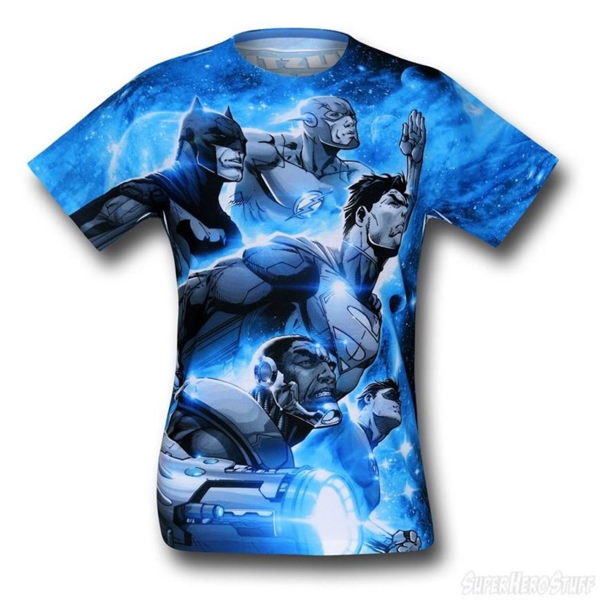
As stated, the line felt fresh and new again. One of the key titles in the New 52 era of DC was Justice League, written by DC’s President and Chief Creative Officer Geoff Johns and drawn by Co-Publisher Jim Lee.
The book became DC’s flagship title in this era. Not only did the Justice League feel fresh, it made the book relevant again. Instead of feeling like the title was creating its own continuity, the whole line revolved around what was going on in the pages of Justice League. The book was constantly in the top 5 of the comic book charts, which is where it belonged.
Overall, the art from Lee and Ivan Reis was great, and the stories from Johns were excellent.
DC’s other top-selling title of this era was writer Scott Snyder and artist Greg Capullo’s entire run on Batman.
Batman has been the stand-out character for DC this whole millennium, dating back to the legendary “Hush” story arc in 2002 by Jeph Loeb and Jim Lee.
Batman was a popular title when Grant Morrison was at the helm from 2006 till 2009, but Snyder and Capullo took the character and title to a whole other level. It felt like they were adding to the mythology of Batman, giving him new villains like the Court of Owls rather than just rehashing the same stories over and over again. The book was constantly in the top 3 of the comic sales charts.
One final and great aspect of the New 52 was the resurgence of a strong female presence. Rather than Wonder Woman carrying the weight, two books helping the cause were Batgirl by writer Gail Simone and artist Adrian Syaf….
….and Harley Quinn by co-writers/artists Amanda Conner and her husband Jimmy Palmiotti. After all, there are female comic book fans despite what stereotypes may tell you.
The Bad:
While there were a few good aspects to the New 52, there were a few misfires. One general criticism of the New 52 relaunch was how it got rid of aspects of characters that worked. It seemed like they got rid of everything that made the characters great.
One character that was a perfect example of ‘throwing the baby out with the bath water’ was Superman. They had a golden opportunity to reboot Superman and get rid of some of the bad stories from the previous continuity from 1986-2011. They had Grant Morrison writing Action Comics and Rags Morales on artwork duty. Seems good on paper, right? Nope. The stories were confusing and just bad. It seemed like Morrison was trying to be clever instead of just trying to tell a good story.
While Action Comics stank, Superman was, for the most part, OK. DC got legendary artist/writer George Perez on writing duty with Jesus Merino providing the art. You can tell Perez was trying so hard to make the story work, and Merino did a great job on the artwork.
However, the big reason why Perez had to hold back on Superman was because Morrison didn’t tell Perez his run on Action Comics took place in the past. So, if you were one of those confused readers wondering why there were so many contradictories in the books, that’s why.
One more bad memory of the New 52 era was the new logo for DC Comics. In 2012, the company went from having a cool, stylized symbol that had been around since 2006…
To a confusing, weird looking icon that seemed out of place when paired up with the Marvel or Image logos.
It personified everything wrong with New 52. The new logo seemed like it was a first draft idea that nobody else seemed to add any creative input on and they went with it. It is weird and unrecognizable, just like DC had become.
Thankfully, when Rebirth occurred in 2016, DC changed their logo to something familiar but new at the same time…
Which perfectly describes the comics DC makes now.
So, those are my thoughts on the New 52. Agree with me? Think I need to be erased from The Source’s continuity? Let me know in the comment section below!