First, I need to get something out of the way. I have loved Marvel Comics my entire life. I’d say Marvel takes up a majority of my entire comic book collection. When my pull list was at its peak, I was collecting seven Marvel titles and only two DC titles. So, I am saying all this because it all comes from a place of love.
From plummeting comic sales to the online conduct from some of their writers and editors alienating their core fanbase, Marvel has run into their fair share of problems this decade. However, there is one glaring issue the house of ideas needs to address: the artwork.
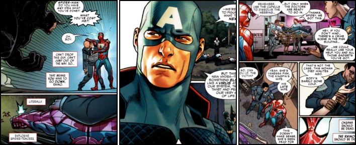
This decade, as I browsed through my local comic book store, I couldn’t help but notice that the art quality in a lot of the titles Marvel produced dropped dramatically. Sure, some great artists have worked for Marvel this decade, like Jesus Saiz on Steve Rogers: Captain America,
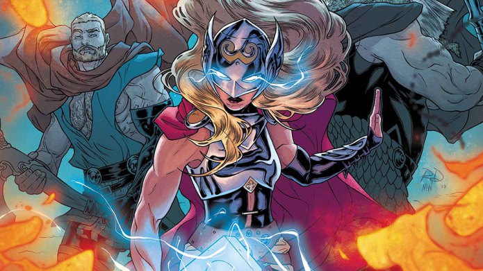
Russell Dauterman on The Mighty Thor,
and not to mention Sarah Pichelli on Spider-Man.
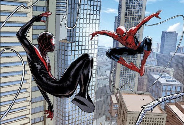
They are all great artists in their own right, but I think they stand out more because, compared to the other artists in the Marvel Bullpen right now, they are magnificent. I know art is all subjective, but let’s compare them to their colleagues.
I really want to like the Mark Waid’s run on Captain America now, but the art by Chris Samnee is getting in the way. Some may like the old timey feel to his style, but it isn’t appealing to me. It looks too plain for me. The coloring looks like it was all done on a computer.
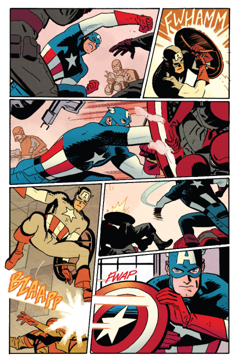
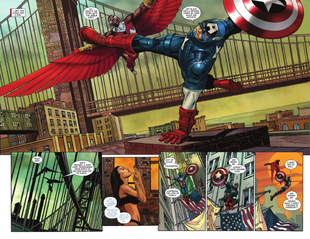
Let’s compare that page to one drawn by previous Captain America artist Carlos Pacheco from just a few years ago.
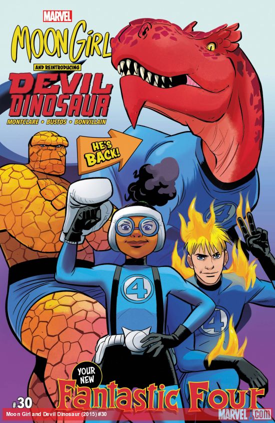
Another book I see on the shelves is Moon Girl and Devil Dinosaur. The name alone catches my eye (good marketing on Marvel’s part). However, when I thumb through it, the art by Natasha Bustos just comes off as a little too cartoony for my taste.
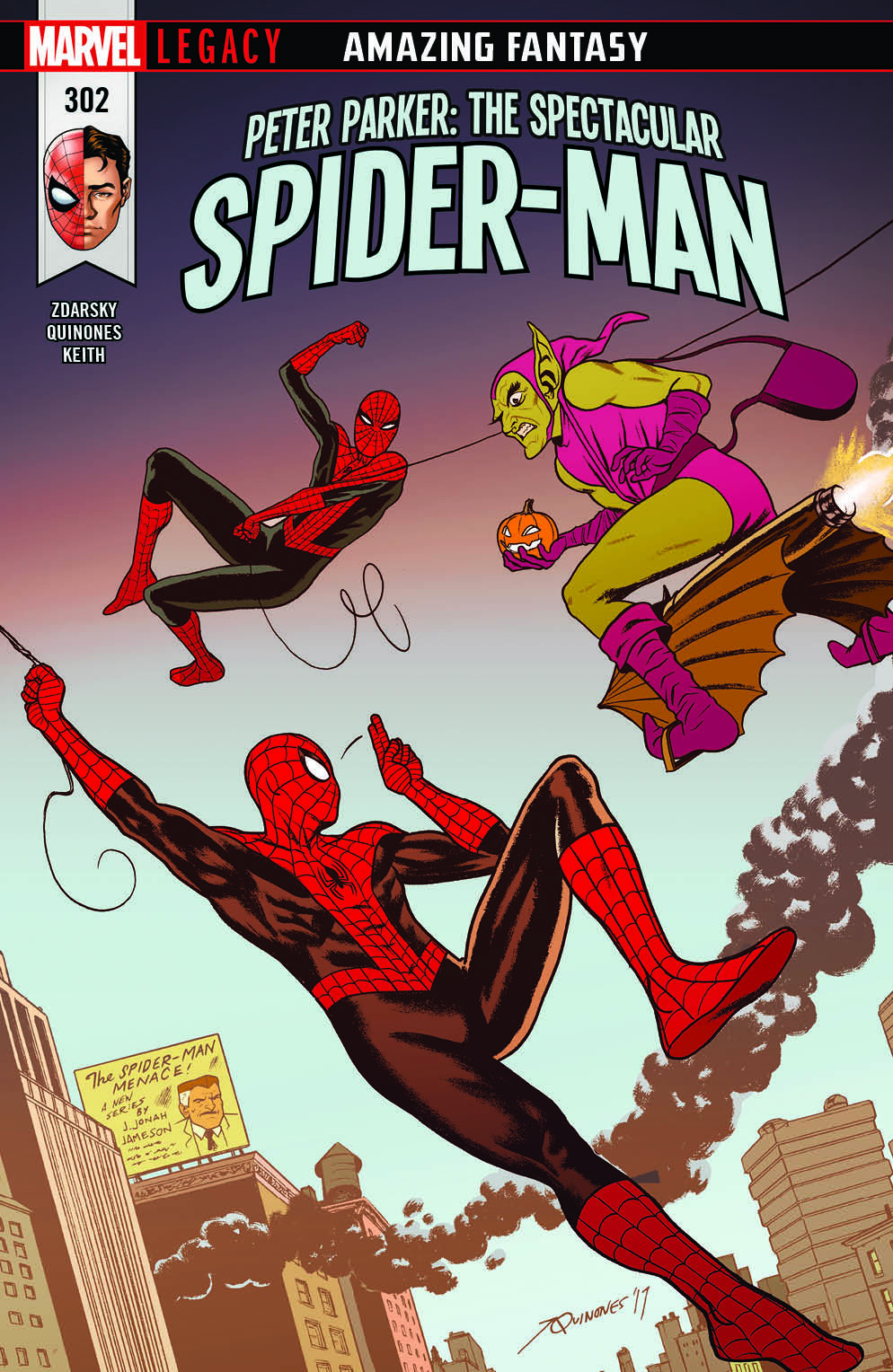
Joe Quinones’s art on the Spectacular Spider-Man looks too flat, and again, too cartoony. Also, he and Samnee seem to have the same approach to art with a minimalist approach to background.
Now compare Quinones’ work to former The Amazing Spider-Man artist Steve McNiven. He drew a similar looking cover to the start of the “Brand New Day” arc way back in 2008. I feel old just typing that sentence.
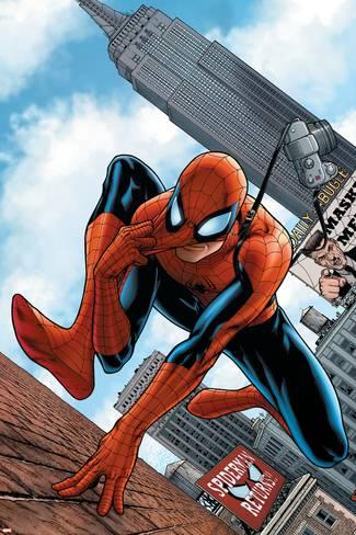
Notice the buildings have texture. And what are those behind Spidey? Clouds! There is so much more detail in this cover — more than that Spectacular Spider-Man cover.
Look, I guess what I’m saying is, I want more realism in my comic art. Maybe they are trying to mimic the art styles of John Romita and Jack Kirby, the greatest pair of artists everl. No disputing there. But it seems like Marvel’s overall art has become boring. There’s no style to it. No personality.
At one point, Marvel had some of the best in the industry at their helm: John Romita Jr. on The Amazing Spider-Man, Steve Epting on Captain America, John Cassaday on The Astonishing X-Men, David Finch on New Avengers, Alex Maleev on Daredevil and Mike Deodato on The Incredible Hulk. But it isn’t 2004 anymore.
I just don’t like the direction the artwork is headed in. The artwork in the comics should look like it has texture and depth. I hate to use the “L” word, but some of the artwork looks lazy.
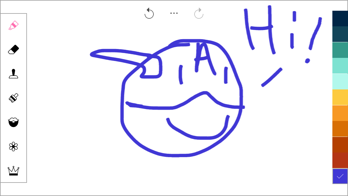
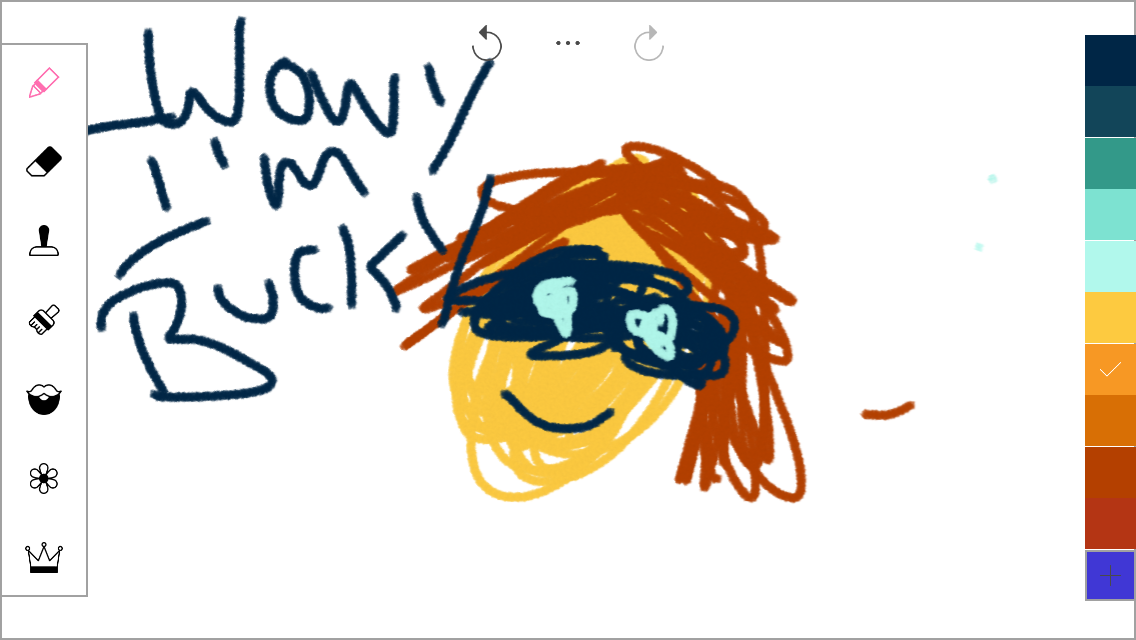
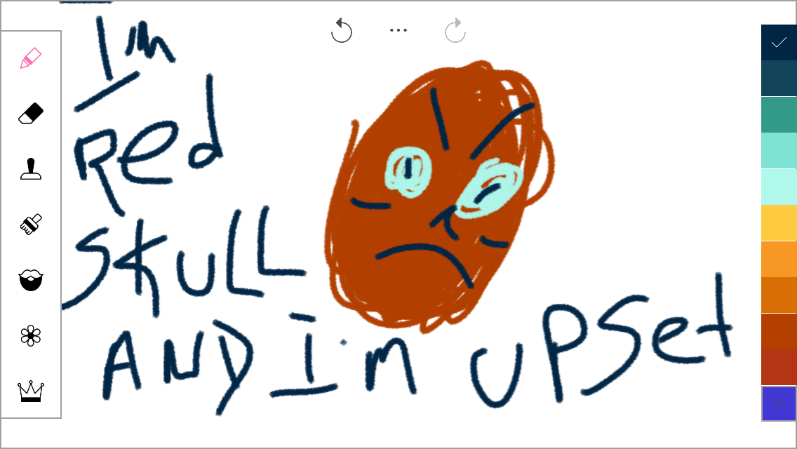
And keep in mind I am not saying I could do a better job than anyone at Marvel. If was in charge, some of the books would look like this.


Absolutely 110% disagree with you. Btw, all comics coloring now is done on a computer and Chris Samnee and Joe Quinones are phenomenal. Just because you only like hyper photo realism doesn’t mean everything else is bad. You just have poor taste and don’t like a classic art style. I’m assuming you weren’t a fan of Darwyn Cooke either. It’s also Jesus Saiz, not Sauz.
Newsflash; every single one of those images posted was “colored on a computer.”
And, oh the irony of moaning about cartooning in freakin’ comic books…
Just cos its rendered to shit doesnt make it good.
sounds like it’s more your problem rather than “Marvel’s Artwork Problem” – so you prefer detailed illustrations? That’s great. There’s more to life and comics than detail work. Art styles can be an acquired taste sometimes. Samnee is a genius. Try checking out some Steve Rude, Russ Manning, Alex Toth, too.
Not really a good article. Just because something isn’t gritty realism doesn’t mean it’s styleless. I’d rather more varied, cartoony styles than everything looking like the same comic. Also, proofread in the future, there are a couple spelling mistakes.
You’re aware that all of the examples you gave of material that you do like were definitely coloured on a computer, right?
I am a Comic Creator and Animator on YouTube. I read Comics all my life, this the most insane article I have come across. You didn’t word yourself correctly Keith. Do some research before you do an article.You know, those Comic’s that you named as “real” art, was also done by computer. Actually, many, if not, all Comic’s during and after the 90’s were colored by computers. To say the art has gotten lazy bscause computers is just wrong because for a long time, Comic’s were all done using computers. Your problem is art style, and even then I wouldn’t call easy or lazy because even you couldn’t draw or color Captain America’s head yourself. Digital helps to put more clean line art and clean colors so the page is not cluttered. The story is more easier to understand. Putting more art texture and detail on page is sonetimes not a good idea to tell a story through illustrations. But again, your not an artist as you say, so you wouldn’t understand. Again, if you want more “realism” in your Comic’s, there are other books for that. Do your research and think before you write articles. This is just
Comments are closed.