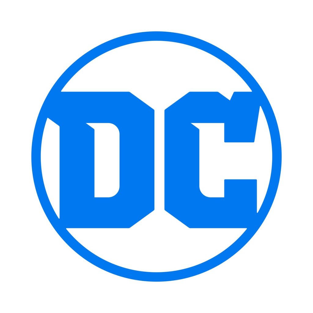
Finally! That terrible looking excuse for a company seal revealed back in 2012 was complete and utter sh*t; it looked like someone peeling a decal from something shaped like the head of a pliers. If anything successfully portended the consistent mediocrity of the New 52, it was this very telling DC logo. Thankfully, the sub-par DC branding is exiting along with DC’s sadly sub-par, New 52 comic line when DC REBIRTH #1 hits the stands. Yes, the new DC Entertainment Logo is here, and we’ll see it immediately on various digital platforms such as DC websites, social media channels, the DC All Access webseries, and the DC All Access apps before appearing on all DC content and products. Take a look!

Nifty, eh? I would definitely consider this an improvement.
Amit Desai, DC Entertainment Senior Vice President of Marketing and Global Franchise Management, offered the following statement describing the impetus behind DC’s much-needed logo update.
“While comics continue to be the heart and soul of DC, the brand has evolved to now stand for powerful storytelling across so many different forms of media. DC is home to the greatest Super Heroes and Super-Villains, and the new logo has the character and strength to stand proudly alongside DC’s iconic symbols. The launch of the new logo is the perfect tribute to DC’s legacy, exciting future and most importantly, our fans.”
Geoff Johns, DC’s Chief Creative Officer added, “I’m very proud that REBIRTH will be the first comic book published with the new DC logo. To me, REBIRTH and the new DC logo are built on what’s come before while looking to what will come tomorrow. I can’t wait for people to see it on the cover.”
A recent DC Press release stated that “one of the many benefits of the new logo design is its versatility to showcase DC’s iconic and timeless characters and stories across all media.” Hmmm. Sounds like the new DC Logo will morph a bit to reflect certain characters or forms of media dispersal. Yes, the old logo did that, but it was the old logo, meaning it looked terrible.
So, what do you think of the brand new DC Entertainment Logo?? I like it. I really, really like it. YAY, REBIRTH!!!!


Haha I wasn’t a fan of the older one either. They mentioned they did the redesign to better suit all forms of media, including social media, official letterhead, etc, so the simple design makes sense.
Great, now it looks like every sports uniform font on the planet. As original as it is simplistic and unimaginative. What’s next? Superman’s “S” changed to this font as well?
We’ve been looking at this logo for over a month now and it still looks 1950s.
We’vebeen puzzling over this new logo for a month now, and it still looks like every sports uniform font on the planet. It’s an improvement on the 1950s logo, but we can’t see Superman’s “S” logo changing to this font anytime soon…
Comments are closed.